
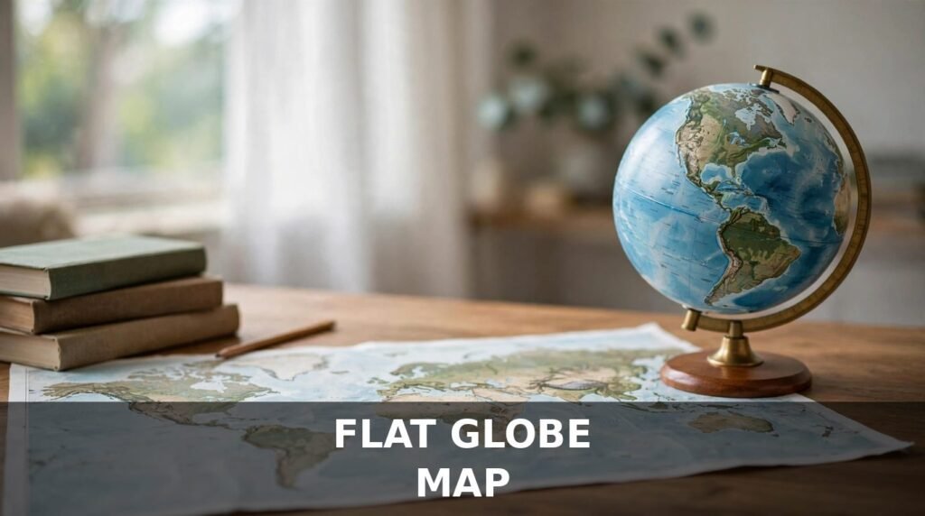
Search “flat globe map” and you will find two different kinds of people looking for the same words. Some have seen a globe and a wall map side by side and want to know which shows Earth correctly. Others have wandered into the flat-Earth debate and want to know whether a flat map proves anything about the shape of the planet. The short answer: a globe and a flat map are not two versions of the same thing. One copies the shape of Earth; the other has to bend that shape to fit on a flat surface, and bending always costs something.
This article explains what the phrase really means, why a globe is the only distortion-free picture of Earth, and how the famous map projections work — and looks at the flat-Earth claim calmly and factually.
What Does “Flat Globe Map” Mean?
A flat globe map is not a standard cartography term. It is a phrase people use when thinking about the same problem from two directions: the globe, round like Earth, and the flat map, which shows the whole world on a flat sheet of paper or a screen.
Usually, someone searching for this phrase wants one of three things: to compare a globe with a flat map, to find a flat map of the world, or to ask whether Earth itself could be flat.
The globe wins on accuracy every time. A globe is a scale model of Earth, so distances, directions, areas and shapes are all in the right proportion. A flat map can never do all of that at once. That is geometry, not a failure of mapmaking.
You cannot peel the surface off a sphere and lay it flat without stretching, tearing or squeezing part of it. Try it with an orange: peel it in one piece and press the peel flat on a table, and it splits and wrinkles. The surface of Earth behaves the same way. The trick is knowing what your flat map sacrifices to be flat, and whether that sacrifice matters for what you are using it for.
A flat globe map can be a useful starting point, even though no flat globe map can match a globe for accuracy. The best way to use a flat globe map is to check what it preserves: if you need true area, choose an equal-area projection; if you need direction, choose Mercator; and if you want a general picture, choose a compromise map such as Robinson or Winkel Tripel. Once you know what a flat globe map preserves, and what it distorts, you can read it without being misled, and you will know when to turn to a globe instead.
Globe vs Flat Map: The Core Difference
Put a globe and a flat world map side by side and the difference is visible at once. On the globe, Greenland looks small, roughly the size it should be next to Africa, and Antarctica is a continent at the bottom, not a long white band across the whole map. You can see at a glance that the Pacific is enormous.
On most flat maps, Greenland looks far bigger than it is — on Mercator it appears roughly the size of Africa, when Africa is actually about fourteen times larger — and Antarctica looks like a giant strip along the bottom.
The reason is simple. A globe keeps the proportions of a sphere because it is one. A flat map has to choose what to preserve and what to distort: every flat map of the whole world distorts at least one of four things — shape, area, distance or direction — and usually several at once. A globe is the reference; a flat map is a working copy, convenient and useful, but always a compromise.
Why a Globe Is the Only Distortion-Free Representation
Earth is not a perfect sphere. Its real shape is called an oblate spheroid — slightly flattened at the poles and a little wider around the equator, because rotation pushes material outward at the middle. The difference is small: the equatorial diameter is only about 43 kilometres wider than the polar diameter, against a total of roughly 12,742 kilometres.
A globe reproduces that shape in miniature: distances stay in true proportion everywhere on the model, and the shortest route between two cities is close to the great-circle route aeroplanes actually fly.
No flat map can do this. Carl Friedrich Gauss proved the point in 1827: a sphere has intrinsic curvature and a flat plane does not, so no mapping between them can preserve all distances. Every projection — the technical name for a method of transferring Earth’s curved surface onto a flat map — is a different answer to the same impossible problem.
What Is a Map Projection?
A map projection is a mathematical method for showing Earth’s curved surface on a flat surface — a set of rules for deciding where each point on the globe goes on the flat page. Different rules protect one quality of the globe while letting the others slip.
Cartographers talk about four properties a map might try to preserve: shape, area, distance and direction. A map that preserves shape is called conformal — local angles are correct, so a small island looks right even if its size is off. A map that preserves area is called equal-area — countries occupy their correct share of the page, but their shapes may be stretched. Some preserve distance from one central point, but none preserves all distances; others preserve direction, so a straight line on the map means a constant compass bearing, which matters most for navigation.
No projection can preserve all four — not even shape and area at the same time. A mapmaker has to pick, and that choice is what makes one world map good for sailing, another good for comparing country sizes, and a third good for a classroom wall.
The Mercator Projection: Built for Sailors, Not for Size
The most famous flat map in the world is the Mercator projection, published by Gerardus Mercator in 1569 to solve one problem: navigation at sea. On a Mercator map, a straight line is a line of constant compass bearing, called a rhumb line, so a sailor could draw a line between two ports, read the bearing, and steer that course all the way. In the age of sail, that was enormously valuable.
The cost is area. To keep angles correct while forcing the meridians to run parallel, Mercator stretches north-south distances by the same factor as east-west ones, and that factor grows toward the poles. Land near the poles is hugely exaggerated: Greenland looks about the size of Africa, and Antarctica is often stretched into a band or cut off entirely.
Mercator is excellent at what it was designed for and poor at what it is mostly used for today. As a navigation chart it is still genuinely useful, but as a general picture of the world it quietly teaches the wrong idea about how big countries are — which is why most modern atlases have moved away from it for general use.
The Gall-Peters Projection: Correct Areas, Stretched Shapes
The best-known response to Mercator’s area problem is the Gall-Peters projection, an equal-area map. Every country occupies its correct share: Africa appears at its true size relative to Europe and Asia, and the tropics, which Mercator shrinks, are shown at their real scale. From the 1970s onwards, Peters promoted it as a fairer map, and it found a home in schools that wanted a map that did not flatter the northern hemisphere.
The trade is shape: landmasses stretch vertically near the equator and squash sideways at high latitudes, so Africa looks unnaturally long and thin. The map is honest about size and dishonest about outline — the mirror image of Mercator’s bargain.
Robinson and Winkel Tripel: The Compromise Maps
Most modern world maps take a third path: they give up on preserving any one property perfectly and keep every distortion moderate. These compromise projections include the two best known, Robinson and Winkel Tripel.
Arthur Robinson designed his projection in 1963, largely by eye — he adjusted the mathematics until the map simply looked right. It preserves nothing exactly, but it does not badly distort anything either. The National Geographic Society used it as its standard world map from 1988 to 1998.
Winkel Tripel replaced Robinson at National Geographic in 1998 and is now the most common general-purpose world map. Its name comes from the German for “triple”, because it aims to minimise three kinds of distortion at once: area, direction and distance. It is not perfect — no flat map is — but it is a good all-rounder.
| Projection | Published | Preserves best | Distorts most | Best used for |
|---|---|---|---|---|
| Mercator | 1569 | Direction and local shape | Area, especially near the poles | Navigation and sea charts |
| Gall-Peters | 1855 / 1970s | Relative area | Shape, stretched near the equator | Comparing country sizes fairly |
| Robinson | 1963 | Nothing exactly; balanced look | All properties slightly | General classroom and atlas maps |
| Winkel Tripel | 1921 | Nothing exactly; low overall distortion | All properties moderately | Modern general world maps |
How to Read a Flat Globe Map Without Being Fooled
Once you know that every flat map distorts something, you can read maps more sceptically. First, ask what the map is for: a navigation chart may distort area because its job is direction, while a map comparing countries must get area right — so compare sizes on an equal-area map or a globe, not on Mercator.
Second, check the high latitudes, where projections distort most. If Greenland looks as big as Africa, you are looking at a Mercator-style map — do not trust it for size.
If countries look stretched tall near the equator, you are probably looking at an equal-area map — do not trust it for shape. And remember that the shortest route on a globe is rarely a straight line on a flat map: aeroplanes flying from North America to Asia often pass near the North Pole, which looks like a detour on a flat map and is the shortest path on a globe.
What About the Flat-Earth Claim?
The phrase sometimes leads people toward the claim that Earth itself is flat, so that idea is worth dealing with directly. The scientific position is clear: Earth is an oblate spheroid, slightly flattened at the poles and wider at the equator, and that rests on observations anyone can check, several known since the ancient world.
The oldest is the disappearing ship. When a ship sails away, its hull disappears first, then the lower structures, and finally the mast sinks below the horizon; an approaching ship appears mast-first. On a flat Earth the whole ship would stay visible and only get smaller. The hull vanishes first because the ship is sailing over a curve.
The second is the lunar eclipse. During one, Earth passes between the Sun and the Moon and casts its shadow on the Moon — and that shadow is always round, whatever Earth’s orientation. Only a sphere always casts a round shadow; a flat disc would sometimes cast an oval or a line. Aristotle noted this in the fourth century BCE.
The third is the changing sky. Travel north or south and the stars above you change: Polaris appears higher as you travel north and disappears south of the equator, while the Southern Cross cannot be seen from most of the Northern Hemisphere. On a flat Earth, everyone would see the same stars.
Modern evidence agrees: Eratosthenes measured Earth’s circumference around 240 BCE by comparing the Sun’s shadow at two Egyptian cities, arriving remarkably close to the modern value, and today satellite photographs show Earth’s round shape directly.
None of this means flat maps are a trick. The flat-Earth claim confuses the map with the territory: because Earth can be drawn flat on paper, it concludes Earth must be flat. But a flat map is a way of showing a round world on a flat surface, and its distortions are the proof of the curve, not evidence against it.
Which Should You Use: A Globe or a Flat Globe Map?
The practical answer is both, for different jobs. Use a globe when the shape of the world matters — comparing country sizes, judging true distances, or teaching children how the planet looks. Use a flat map when convenience matters: hanging it on a wall, printing it in a book, or navigating a city.
For a home or classroom, a globe is worth having even in the age of digital maps: spin it and you can see how small Europe is next to Africa and how wide the Pacific really is. For a wall, a flat map is usually better — Winkel Tripel or Robinson for a general world map, an equal-area map for comparing countries, Mercator for navigation.
Conclusion
A flat globe map is a contradiction in terms — and that contradiction is the whole story. A globe shows Earth as it is; a flat map shows Earth as it can be drawn on a flat surface, and every way of doing that distorts something. Mercator keeps direction and sacrifices area; Gall-Peters keeps area and sacrifices shape; Robinson and Winkel Tripel keep everything moderate and nothing perfect. None of them is the true map, because there is no true flat map of a round world — so match the map to the job and keep a globe handy as the reference.
Frequently Asked Questions
What is a flat globe map?
A flat globe map is not a formal mapmaking term. People usually mean a flat map of the world, or are comparing a globe with a flat map: a globe is a round scale model of Earth, while a flat map shows its curved surface on a flat sheet, which always involves some distortion.
Is a globe more accurate than a flat map?
Yes. A globe is the only distortion-free representation of Earth, because its shape matches the planet — while every flat map distorts at least one of shape, area, distance and direction.
Why do all flat maps distort Earth?
Because Earth is a sphere and a map is flat. A sphere’s surface cannot be flattened without stretching, tearing or squeezing part of it — a fact proved mathematically by Carl Friedrich Gauss in 1827. Every projection is a different compromise about what to preserve and what to distort.
Which map projection is the most accurate?
There is no single most accurate projection: Mercator is best for navigation, Gall-Peters for comparing country sizes, and Robinson and Winkel Tripel for general world maps. The right choice depends on the job.
Why does Greenland look so big on most world maps?
Because most familiar world maps use the Mercator projection, which exaggerates area near the poles — on it, Greenland looks roughly the size of Africa, but Africa is actually about fourteen times larger.
Does a flat map prove the Earth is flat?
No. A flat map is a drawing of a round planet, and its distortions are caused by Earth’s curvature, not evidence against it. Ships disappearing hull-first, Earth’s always-round eclipse shadow, different constellations by latitude, and satellite photographs all confirm Earth is an oblate spheroid.
For everyday living tips, home ideas and practical guides, DailyOrvix is a handy place to browse.
Read Also: Little Dipper Dipper: Finding the Little Dipper in the Night Sky